The Making of a Renaissance Festival Mug
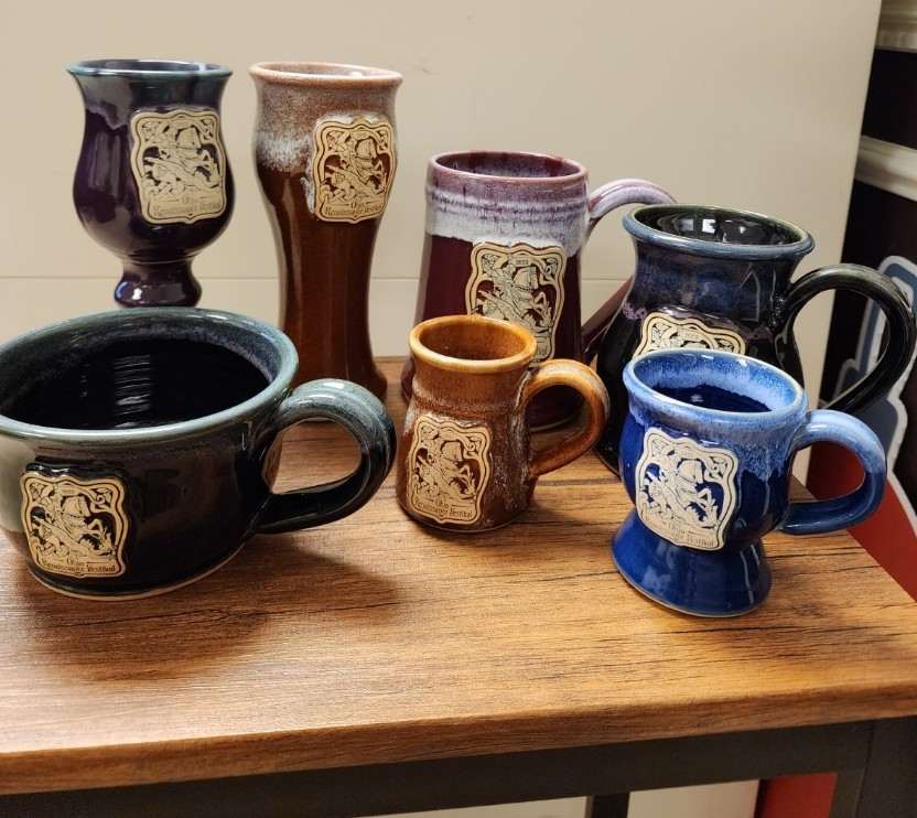
For many Renaissance Festival enthusiasts, one of the first things to do every season is pick up a commemorative mug. Across the nation, these clay, stamped mugs have become synonymous with Ren Faires. But how does one come into existence? They are, after all, not an invention of the mass market, but instead a unique annual offering meant to commemorate not only the festival they hail from but the times in which they were made.
At the Ohio Renaissance Festival, planning for next year’s mug often begins even before the end of the previous season. As the Ohio leaves turned golden in the dying October sun of 2022 the mug illustrator of the Ohio Renaissance Festival, Laura Osburn, was hard at work planning for 2023.
Designs From Years Past
“2023 will be the fourth mug stamp I’ve designed for ORF.” Says Laura. “By now, I’ve settled into a good routine, but I have to admit this is both my favorite and the most nerve-wracking thing I do all year.”
That’s because it’s a big job and the result will be not only something people enjoy coffee out of but something people line up for, something they put in large glass cases to complete a collection dating back three decades.
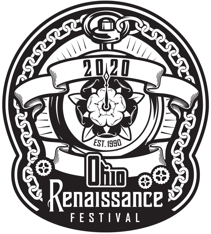
“My goal is always to make a good-looking stamp but I also want it to say something about the year of ORF that it is representing. The 2020 mug was created in late 2019 and the general feeling was that of a new era starting, ORF had had its 30th anniversary. That’s why we chose the Tutor Rose pocket watch. Little did we know we’d be right in all the wrong ways.” Laura says with a laugh. “I did a lot of research on pocket watches and found out they were invented during the festival’s time frame and even that Queen Elizabeth I had one as a novelty.”
If the 2020 mug hadn’t been designed before the pandemic started it definalty would have been a plauge doctor!”
Laura Osburn
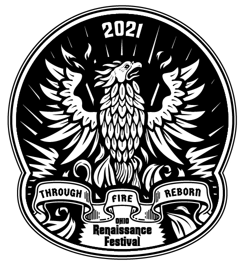
“2021 was something special, and I knew the stamp had to be special as well. ORF had made it through the worst of the pandemic after being shut down in 2020 and we were all experiencing a rebirth. That’s why the only imagery I could think of that was fitting enough was a phoenix. We’d actually done a phoenix in 2018, but the symbol was too great not to use. There was also something about feeling like the world was on fire, but I could never fully figure that one out.” Laura chuckles. “I drew the phoenix by hand instead of jumping right into an illustration program because I wanted it to feel a bit rough, raw, and full of energy.”
“That design just kind of ‘hit.'” Laura explains. “I’d like to say the design was just so awesome that demand was through the roof, but I don’t believe that. I designed it but I don’t believe that. I think the massive demand for that mug was a combination of factors. Everyone was excited to get back to the faire, we had record attendance, it was the first year we drummed up excitement for the mug with a design reveal social media campaign, and thanks to supply shortages coming out of Covid we had fewer mugs available in the shop than we’ve had in previous years. The buzz, demand, and sometimes angst over getting or not getting that mug was sometimes hard to take.”
“We were open in 2021, but everything still felt tentative. Well, that’s probably because it was. 2022 felt somewhat like a return to normalcy. We were ready to swing wide the gates and fire the cannon! This was why I made the iconic Ohio Renaissance Festival front gate the focus of the 2022 mug stamp. I wanted everyone to feel welcomed back to their home away from home.”
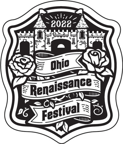
“We had an overarching theme of fairytales, fables, and legends in 2022 so I wanted the gates to look like something out of a storybook. Wild roses growing outside a fantasy village where anything could happen once you step through the gates. My Pinterest board was filled with book engravings and gilded book covers from fairy tale books throughout the centuries. This was also the year we were dealing with a healthy amount of growing pains. Everything felt beautiful but a bit chaotic at times. The wild thorned roses seemed to sum that up for me.”
“I was so nervous to reveal this stamp design, even more than the first one I did for the festival. After the absolute madness over the 2021 mug… I felt like nothing could follow that. We’d also changed from a two-toned glaze like years past to a solid red. There were the inevitable people who did not like it as much as 2021 but I tried not to let that get me down. The mug still sold well and I smiled every time I saw someone drinking out of it in the pubs. They seemed happy and that is what mattered.”
Work began on the 2023 mug in October of 2022. Every year the conceptual stage begins with a visit to the mug archive. The main office of Brimstone & Fire, LLC (owners of the Ohio Renaissance Festival) has every mug dating back to the first one from 1990 on display.
“The mugs tell a story of the festival,” Laura explains. “We like to look back to remind ourselves of that. We are carrying on a tradition. We’ve had certain themes that we revisit often because they are favorites among the Renaissance Festival crowd, but we always want to bring a fresh perspective to them.”
In the past themes have included:
- Knights – 7 times
- Dragons – 3 times
- Wizards – 3 times
- Queens – 3 times
- Lions – 2 times
- Pirates – 2 times
- Griffins – 2 times
- Phoenix – 2 times
- Horses – 1 time
- Unicorns – 1 time
- Pegasus – 1 time
- King Henry – 1 time
- Green Man – 1 time
- Tutor Roses – 1 time
- Jesters – 1 time
- Pocket Watch – 1 time
- The front gate – 1 time
Color is the same way. Color lends itself to the theme and vice versa.
In the past, colors have included:
- Blue – 10 times
- Purple – 5 times
- Black/grey – 4 times
- Green 4 times
- Brown – 3 times
- Teal – 3 times
- White/cream – 2 times
- Red – 1 time
- Orange – 1 time
The Creation Process of The 2023 Ohio Renaissance Festival Mug
Phase 1: Choosing a Theme
So how do we continue to tell the story of ORF visually?
“We worked through our growing pains of 2021 and 2022. The festival really made a lot of changes during those years, with more changes in the works as 2022 came to a close. Sometimes the challenges we faced felt huge, but in the end, we all had a feeling that we were tackling them head-on. In some ways, we felt like David and Goliath or perhaps… St. George and the Dragon?”
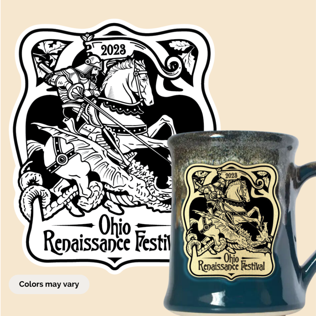
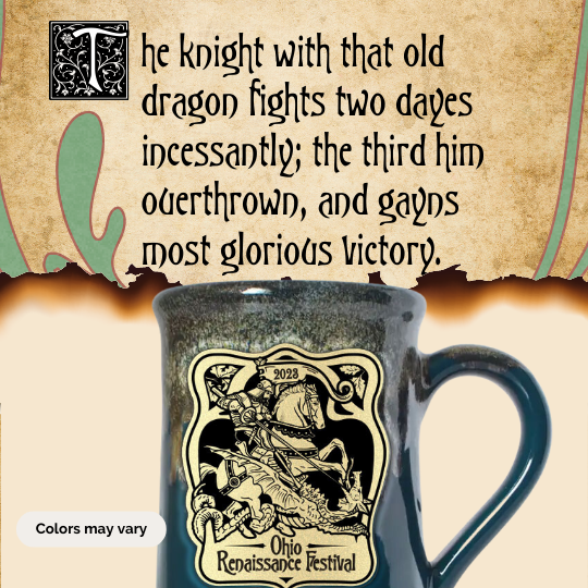
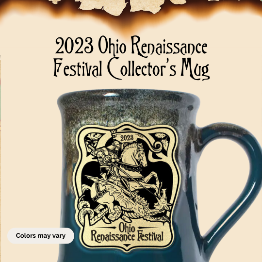
Yes, not very subtle there. The 2023 Ohio Renaissance Festival stamp design will be St. George slaying the dragon!
“A lot of factors went into that choice. It was not long after the death of Queen Elizabeth II, and it felt appropriate to honor the land we were already paying homage to, England, with their patron saint. And after the relatively serene gate design of 2022, I wanted to ‘bring the action.'” Laura explains.
“We’ve long held the tagline ‘where fantasy and history collide’ and I wanted to go ahead and make that the theme of 2023. What could be better than knights and dragons!?”
Phase 2: Research
Once a theme is chosen research needs to be done.
“The imagery we choose often comes from history so it has a lot of meaning and importance behind it. It’s important to know what you are saying with your imagery.” Laura tells us. “The history of the imagery, where it has been used before, who has used it, and what it is commonly understood to mean all need to be considered.”
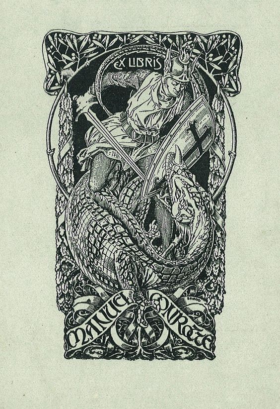
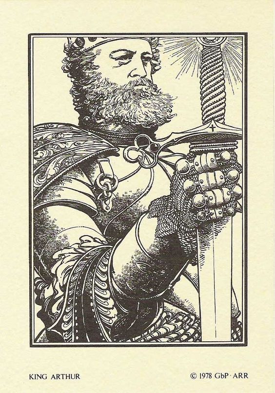
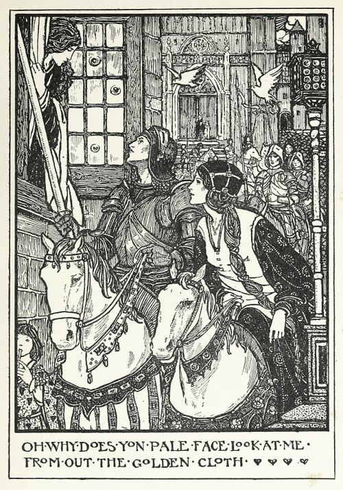
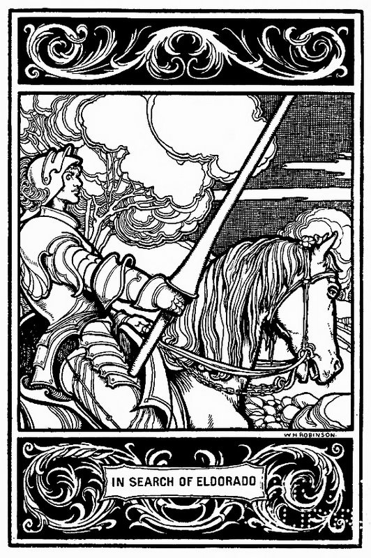
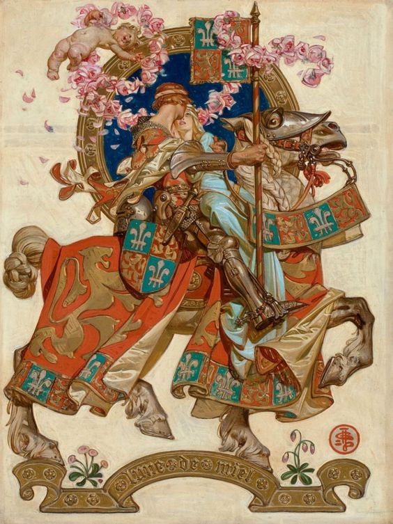
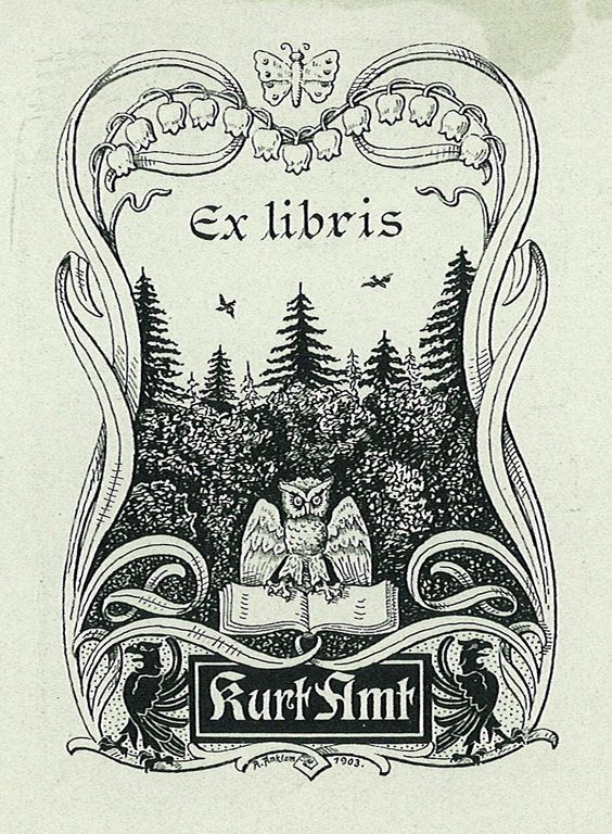
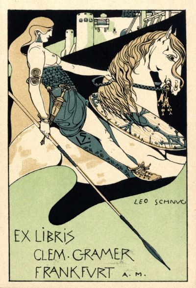
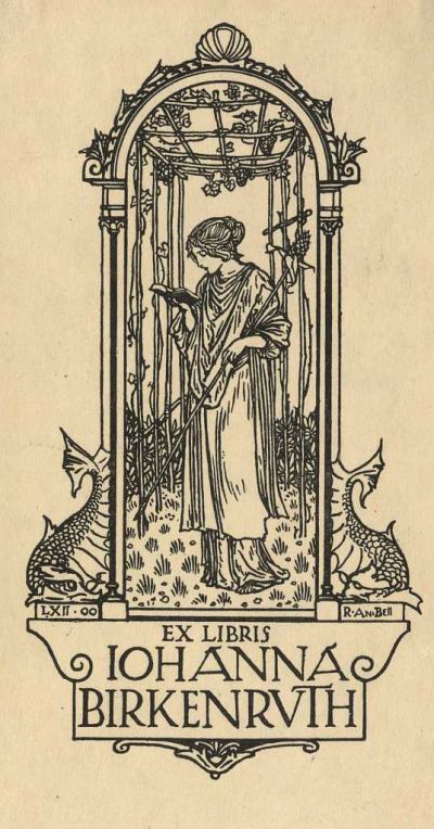
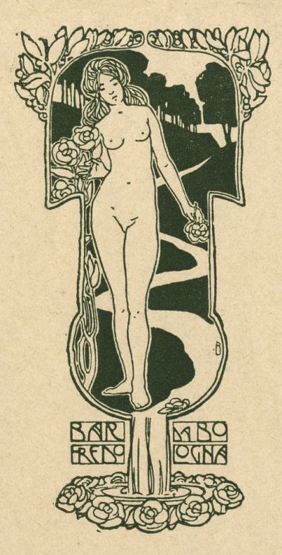
My Pinterest board was filled with engravings and paintings of St. George and the dragon from Renaissance times through the early 20th century. He has been an important subject matter in Western art for a long time. I also collected a lot of ex libris bookplate designs from the late 1800s and early 1900s. Their Romantic art nouveau depictions of knights and maidens framed by beautiful organic borders inspired me. I wanted Renaissance Festival meets medieval as seen through turn-of-the-century art nouveau.”
Laura Osburn
A few pieces that inspired the 2023 mug stamp design:
Phase 3: Designing The Mug Stamp
Once the design has been chosen, researched, and vetted it is time to put pencil to paper.
“If I’m doing something more graphical and structural I’ll just jump into an illustration program, like when I made the pocketwatch and front gate designs. If I’m doing something more figurative, I begin with sketchings, like the case with the phoenix and now St. George and the dragon.” Laura tells us.
“I’m never drawing in my own illustration style. Often I’m trying to mimic the look of art styles of the past, such as woodcuts and engravings. The mug stamps are small, and though our potter is wonderful at getting a surprising amount of detail on them, there is a limit. As an artist, I need to balance areas of detail and fields of either black or white to keep the image ‘readable.’ That’s another challenge, I only have black and white to work with. No color and no shades of grey. Everything is either 100% glaze or the color of clay, with no in-betweens. I’m often trying to mimic the look of historical art that has details upon details with only about 30% of the lines.”
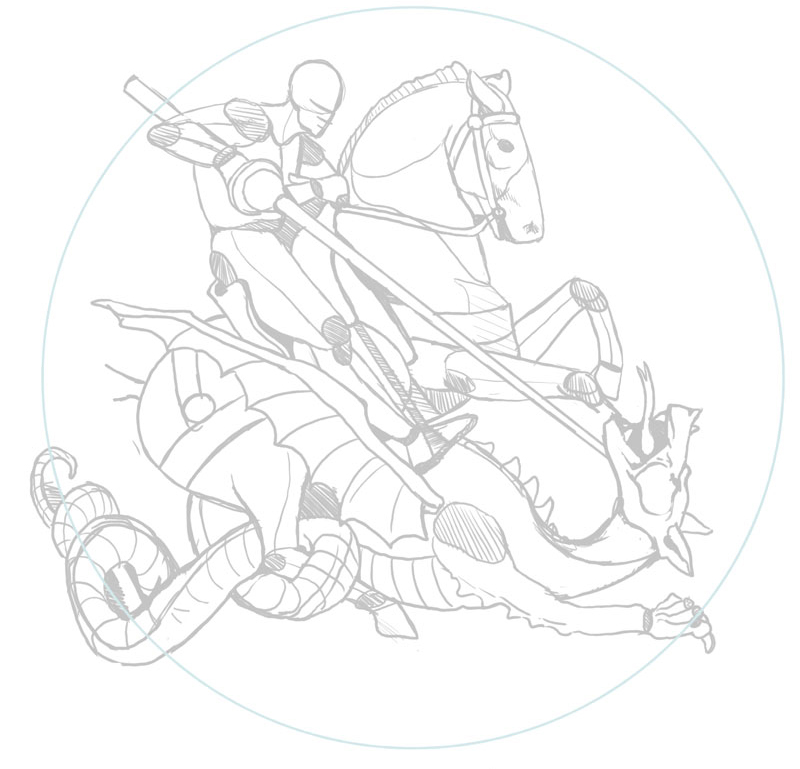
“I start with a rough sketch and slowly refine it. In this stage, I’m making decisions about the pose and how to distribute areas of high detail and open areas.” Laura explains. “I’m also going in between my drawing and looking at historical referencing asking myself ‘How did they draw a dragon head?’ or ‘What is a really iconic pose?’ so the illustration can look historical.”
“The nature of the mug stamps means you have to work hard to make sure it is very clear what things are. That’s why putting things in profile or head-on view works well, they have a more defined shape. If elements overlap I need to put heavy shapes, shadows, or strokes between them to separate them. Personally, I love dynamic poses and I collected a lot of great artwork where it looked like St. George and his lance were leaping out at you. Almost to the point where it looked like a 3D poster. But that wouldn’t work well in mug stamp form. It would be too hard to tell what was going on. Illustrations like that also tend to look very modern, which is definitely not the vibe we are after. The ‘field of depth’, so say, needs to be very shallow.”
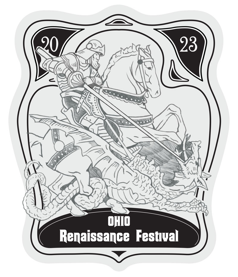
“Next I create a more detailed sketch. It is important I further plan what will be black and what will be white in this stage so the final illustration will be balanced.” Says Laura. “I also draw within the frame shape I’ll be using to make sure it will fit. The frame for this year was inspired by art nouveau designs. I love using very curvy stamp shapes because they look great against the mug. I considered using a simple circle this year because I felt the illustration would be pretty detailed and we could pull back on adding more complexity, but ultimately I’m glad I didn’t.”
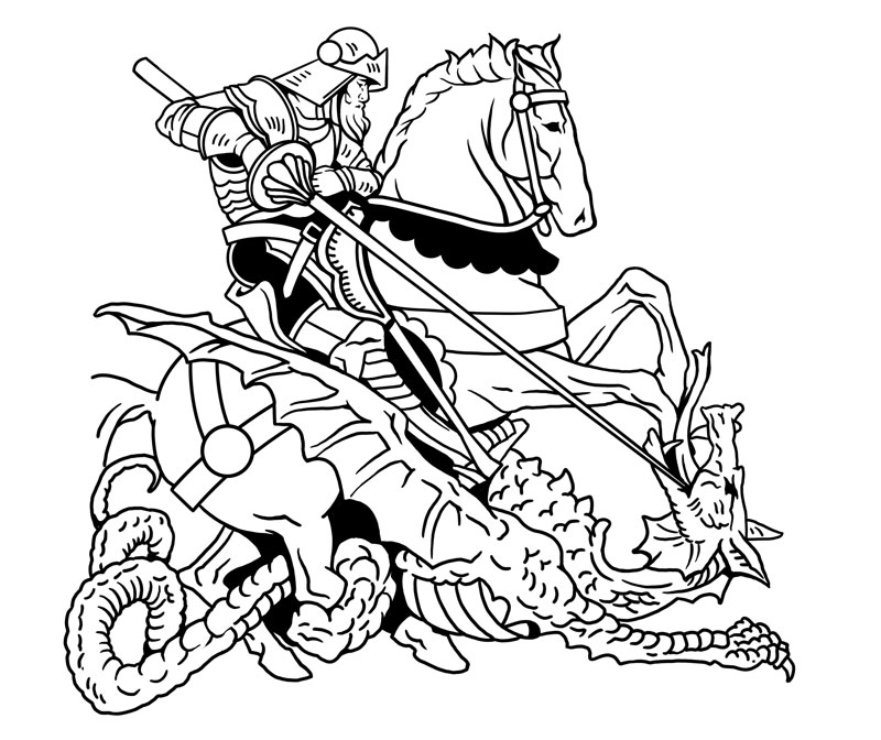
“We’re at the next to last step for the design, inking. Since the final design will be black and white, I need to render my sketch into very clean black lines and shapes. The cleaner the ink drawing is, the better the final outcome so I take my time here.” Laura explains. “My drawing process is digital, I use a graphic tablet, but at this stage, I’m still drawing in raster. The drawing will now need to be converted into a vector format for the potter.”
If you’re not a designer or artist and wondering what raster and vector mean, I’d say don’t worry about it. Just know that the drawing will need to be converted by another computer program to finish the stamp design.
“Now comes my favorite part, finishing the stamp.” Laura smiles. “So far, the design has been pretty rough on screen and it’s only been in my head that I can see the final vision. Now I get to try to realize that vision.”
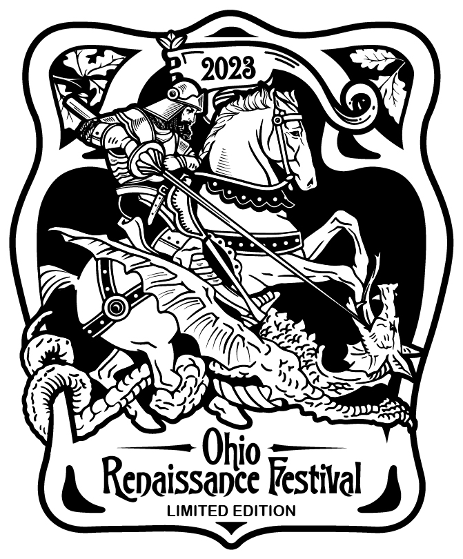
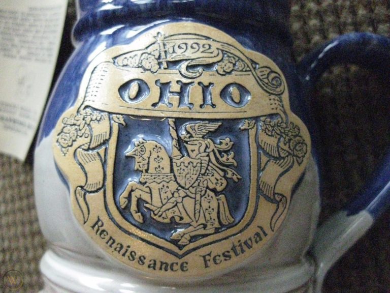
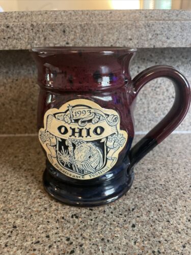
“A lot changed in this step. I redrew the face to be stronger and added details throughout. I also brought in the flag to hold the year date.” Fun fact, this flag was the same one used in the 1992 and 1993 mug stamps. “I first brought it back in the Royal Feast mug, and I wanted to use it again because I felt it was a nice callback to 30 years ago.”
“With the year moved, I added oak leaves to symbolize longevity, strength, stability, and endurance. Last but not least, the type. I fell in love with this organic art nouveau font.” Laura claps. “And with that, we are done! Well for 2023 at least. When this comes out in September of 2023 I’ll be starting the 2024 stamp.”
Phase 4: Making The Mugs
The design is then put in the hands of Grey Fox Pottery. Grey Fox, of Minneapolis, has been making the Ohio Renaissance Festival mugs for years. All mugs are handmade in the USA. They also support livable wages for their workers so you can feel good about purchasing a mug from our souvenir store.
The mugs are either thrown by hand or molded in forms. The stamp design is cut into clay sheets using a die and then applied to the mug using slip.
The mugs are loaded into the kiln and bisque fired. This is the first firing of the mugs and it permanently changes the chemical nature of the clay. After the bisque firing, the mugs will be hard but still porous enough to accept glaze.
Glazing is no small feat. First, black or a contrasting color glaze is rubbed over the stamp design to fill in the lines and shapes of the design. Then a layer of wax is brushed over the stamp to stop the next set of glazes from adhering to the “white” parts of the design so those areas will remain a light clay color. Now the mug is dunked in the first glaze color and then the top of the mug is dipped into the second color glaze to create a two-toned effect. At this stage, the mug won’t look like its final colors. The color of the glaze will only develop after it has been fired and can be a completely different color beforehand.
Now the mugs are loaded into the kiln for the second and final time. During firing, the glaze changes to its final color and hardens, leaving behind a hard, non-porous surface. The wax also melts off the stamp to reveal the clay and glaze design.
And only a few THOUSAND mugs to make! No wonder mugs for 2023 were already being made as the 2022 season came to a close. We appreciate the hard work of the potters, it is always one of the most exciting moments of the year when the delivery trucks pull onto the grounds with the first round of mugs.
Phase 5: Getting Ready To Go On Sale

The wait can be anxious. The design will be a relatively closely guarded secret. Brimstone & Fire’s marketing company, Lion + Panda, plans a “mug reveal” campaign to hype the launch. Fans of the Ohio Renaissance Festival know when a mysterious image is posted to our social media with no context close to the start of the season, it is the beginning of the reveal campaign. Over the course of a few days, the mug will slowly come into full view.
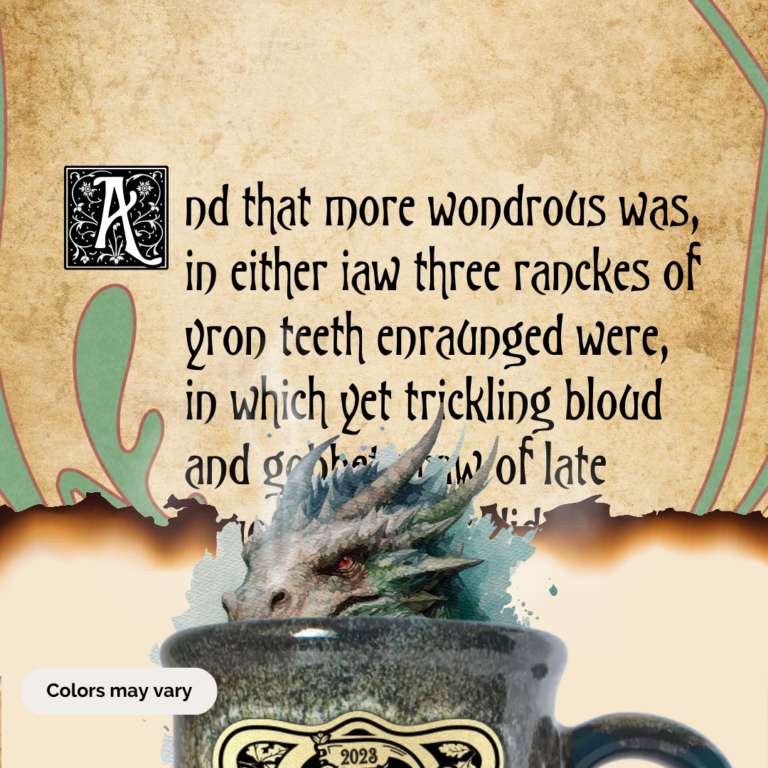
This year’s mug reveal campaign features the epic poem “The Faerie Queen” by Edmund Spenser from 1590. The poem (in part) tells the adventures of the fair Una and her knight, Redcrosse. During one Canto, Redcrosse slays a mighty dragon after three days of a truly epic battle. This part of the poem is often seen as Spenser’s retelling of the tale of St. George and the dragon. Check out more of the poem here.
Everyone gets hyped and ready to grab a mug of their own.
Phase 6: From The Shelf To Your Hands
The festival gates open for the first time of the season and people begin to gather at Treasures of the Realm gift shop as the new mugs glisten on the shelves.
From the conception stage, to design, to a finished clay product the mugs have come through a long journey to end up in your hands so you can remember your festival day fondly. Many people have been involved so far. Artists, potters, marketers, festival staff, and souvenir shop clerks have worked hard to place that mug in your hands.
We hope you’ve enjoyed following the story of your mug being made. The most important phase is yet to come, going home with you. Whether your mug will go in a glass case to complete a collection or hold your morning coffee, we hope it brings you joy. It brought us joy to make it for you.
